PHOTOSHOP LESSON 1

 In today's lesson we went on to photoshop and had to find an image and create nine different versions of it, using levels, brightness/contrast, vibrance, colour balance, curves, exposure, photo filter, black & white and unedited. To do this we used several different layers and effect in order to make each image different.
 Our second task was to replace the colour of an object- for example the pink lipstick was the original colour and then I changed it to a bright blue colour.
 BEFORE AND AFTER COLOUR REPLACEMENT

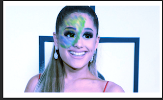
 Before and after liquify tool.

Comments
Post a Comment