Synopsis of Sophie's world, my chosen book for this project.
This book is about a young girl called Sophie Amundsen, at the beginning of the book we find out that she is living in Norway at the age of 14
and shortly after she comes across some letters from a philosopher who at the beginning she
doesn't know the name of or their identity- he talks about the history of
philosophy and how it has developed. Throughout the book Sophie receives a
letter each day, sometimes including packages but these packages and letters
are delivered by Alberto's dog Hermes, these letters include information on
philosophers and the history of how it began. As Sophie's educations continues
she starts to discover more postcards to Hilde, who is another character within
the book and comes across some that are dated June 15th, the day Sophie turns
that age. Throughout the book Sophie learns about the world spirit of
Romanticism, Hegel's dialectical view on history and Kierkegaard's belief and
then the book ends with Sophie wanting to interfere within the world of Hilde
and her father, she as learning to do this as the book ends.
Artist research:
Tim Marrs:
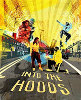
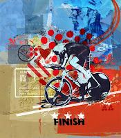
Tim Marrs is a graphic designer and illustrator who is known for his visual work which includes lots of different techniques which include drawings, photography, screen printing, Photoshop work and more; here are some examples.
Throughout his career he has worked with Pepsi, Nike, Maxim, Saatchi and Virgin- Marrs' work has a relatively bold approach along with a dynamic look; these include a mix of inspiration from American pop culture, pulp fiction and pop art. Every piece he has created he has carefully thought about colour and composition/ style to create a perfect blend of these elements. The images that I have shown are very surreal and he brings these images to life- by using bright colours which enable his artwork to stand out. Marrs also incorporates a range of subjects into his work to give it a meaning or story- he's used famous buildings, road signs and even nature- presented in an original manner.
Kate Moross:
Kate Moross is an award winning art director, designer and illustrator, she started to publish her work in 2008 allowing her work to be seen around the world and since becoming famous she has applied her creative skills for music videos, textiles, identities, murals, fashion and magazine covers for big companies. Kate also does solo shows and presentations to big audiences who often say her work is "inspiring".
Many people love her work because it includes many bright colours and she explores different ways of presenting work. according to her website/portfolio "she pretty much is colour", "She loves sweet packaging, dogs, pizza, stickers, knick-knacks, trainers and clothes."
The information that I collected was from her website
http://www.katemoross.com/about-kate
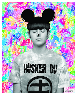
The colours that have been used help stand out to any of her viewers or fans and it might also attract a range of companies and portray her amazing work, Her images are also abstract which could suggest that she is original and her creativity will inspire many people.

Andrew Fairclough:
http://handsomefrank.com/illustrators/andrew-fairclough/
Andrew Fairclough is a talented illustrator and is based in Sydney, from looking at some of his work I can tell that he puts detail into textures and colours. Some of his favourite things include print processes, silkscreen, risograph and photocopying. Andrew himself is part of the "Handsome Frank" illustration industry, they represent 35 illustrators who are spread across five continents, working with brands such as: John Lewis, Sky, Nokia, Sephora, Waitrose, McDonald's and Land Rover. "We work predominantly with clients in advertising, design and publishing."
http://handsomefrank.com/about
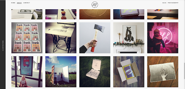
Some examples of Andrew's work:


A4 rough bookmark ideas with annotations:
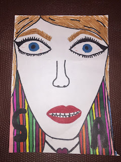

The bookmark design on the left is inspired by Sophie as a character taken from the descriptions within the book, When creating this rough design I didn't pay attention to detail when drawing her character because when reading the book the author pays attention to detail with the letters and the history of philosophy which is why and used plain colours for the character but made the background stand out with using a brighter range of colours. The bookmark design on the right is inspired by many things which occur within the book, firstly, the road with the cars and houses represent Sophie's road, again not paying attention to detail. The bottom half represents the woods located at the back of Sophie's house, the hut that belongs to Alberto (writer of the letters) and the names of some characters mentioned within the book- all of which play a huge part in the book from beginning to end.
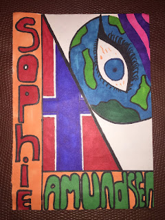

My third rough design on the left was inspired by the location of where the book is held, the name of the young girl receiving all the letters and postcards, an eye to represent looking into the wood trying to discover all and a globe to represent the name of the book "Sophie's Worlds". My final bookmark design was based on this however I made a few changes. The rough bookmark design on the right represents only one thing which is confusion, this portrays the fact that she is confused throughout the book because she doesn't really know what to think of all the philosophy facts written by Alberto Knox himself. The use of bold colours stand out, this was also inspired by Kate Moross, a graphic designer whose work is quite abstract and out of the ordinary.


Comments
Post a Comment