Posts

Illustrator Vector Patterns

For this task I have been given the theme of 90s music, in order to create my ideas I researched different events and songs which were part of that time as well as researching things that were brought out in the 90s and turning them into vectors through Adobe Illustrator! Then once we have done this we use ten images and ten words to create a repeat pattern!

Designer Research

Image
Tim Marrs is a graphics designer and illustrator who is known for his visual work which includes lots of different techniques which include drawings, photography, screen printing, photoshop work and more; here are some examples.   Throughout his career he has worked with Pepsi, Nike, Maxim, Saatchi and Virgin- Marrs' work has a relatively bold approach along with a dynamic look; these include a mix of inspiration from American pop culture, pulp fiction and pop art. Every piece he has created he has carefully thought about colour and composition/ style to create a perfect blend of these elements. The images that I have shown are very surreal and he brings these images to life- by using bright colours which enable his artwork to stand out. Marrs also incorporates a range of subjects into his work to give it a meaning or story- he's used famous buildings, road signs and even nature- presented in an original manner.

Kate Moross inspired work!

Image
Before adding colour on illustrator. In order to create this we had to research some work from Kate Moross and then create our own typography piece but using the idea of the next ten years. After adding colour on illustrator. 

Kate Moross Research

Image
Kate Moross is an award winning art director, designer and illustrator, she started to publish her work in 2008 allowing her work to be seen around the world and since becoming famous she has applied her creative skills for music videos, textiles, identities, murals, fashion and magazine covers for big companies. Kate also does solo shows and presentations to big audiences who often sayer work is "inspiring". Many people love her work because it includes many bright colours and she explores different ways of presenting work. according to her website/portfolio "she pretty much is colour", "She loves sweet packaging, dogs, pizza, stickers, knick-knacks, trainers and clothes." The information that I collected was from her website http://www.katemoross.com/about-kate The colours that have been used help stand out to any of her viewers or fans and it might also attract a range of companies and portray her amazing work, Her images are also abstract whi...
LESSON 4 GRAPHICS

Image
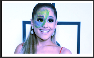
In todays lesson we had to create an avatar version of someone or ourselves, We had to take an image and turn it blue, use the replace colour tool and blend the layers, We then had to create avatar eyes by using the liquifying tool, We then blended more colours into the image, added a background and feather to creator final avatar creation.   

PHOTOSHOP LESSON 1

Image
 In today's lesson we went on to photoshop and had to find an image and create nine different versions of it, using levels, brightness/contrast, vibrance, colour balance, curves, exposure, photo filter, black & white and unedited. To do this we used several different layers and effect in order to make each image different. Our second task was to replace the colour of an object- for example the pink lipstick was the original colour and then I changed it to a bright blue colour. BEFORE AND AFTER COLOUR REPLACEMENT Before and after liquify tool.

Graphics InDesign work

Image
Last lesson on InDesign we were asked to create our own shapes and use different colours to get us used to the programme itself. We were also asked to use a wide range of effects and outlines to explore the different areas of the programme. Another task was to write along a certain line and use gradient effects.